Recongnizing outliers from multivariate data
In this post, I try to identify outliers from a multivariate data set with manufacturing context by using sklearn built-in outlier removal algorithms, and with the help of t-SNE, to plot 2 dimensional chart of high dimensional data. The algorithms that are going to be used in the post are isolation forest,robust variance, local outliers, one-class SVM.
Basic idea of each model
1. Isolation Forest:
Since the number of splittings required to isolate a sample is equivalent to the path length from the root node to the terminating node. This path length, averaged over a forest of such random trees, is a measure of normality and our decision function.
2.Robust variance:
Assumes the data is Gaussian and learns an ellipse. It thus degrades when the data is not unimodal. Notice however that this estimator is robust to outliers.
3.Local Outliers:
The anomaly score of each sample is called Local Outlier Factor. It measures the local deviation of density of a given sample with respect to its neighbors.
4. one-class SVM:
It is known to be sensitive to outliers and thus does not perform very well for outlier detection. This estimator is best suited for novelty detection (detecting ouliers from new samples) when the training set is not contaminated by outliers.
1. Data info
Basically not too much data clean can do in this case, just check null value or any trivial rows or columns exist.
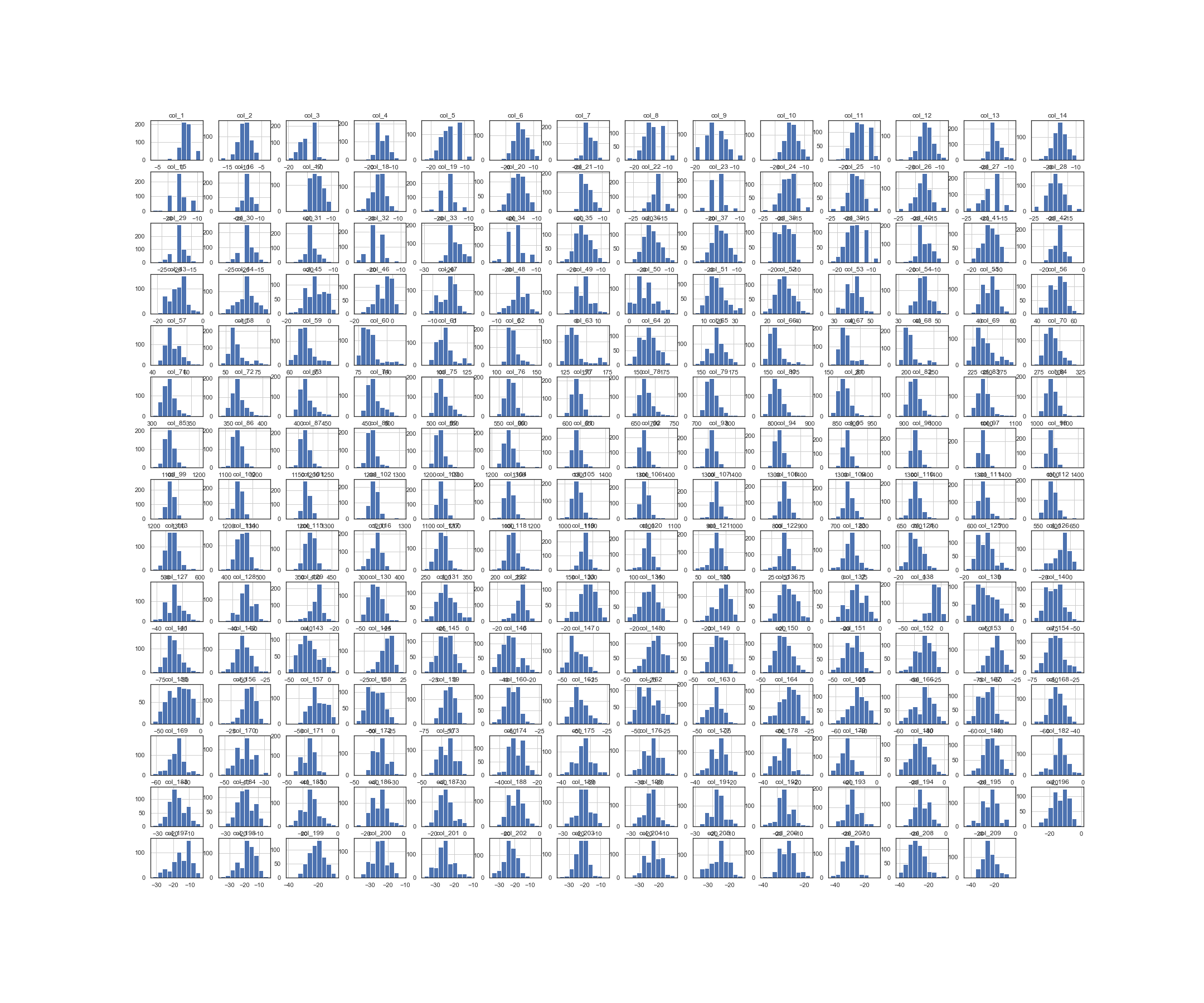
If take a look into each column, looks like most of features followed by Gaussian distribution
import pandas as pd
import numpy as np
df=pd.read_csv('Project_dataset.csv',header=None)
fig ,ax = plt.subplots(figsize=(30,25))
df.hist(ax=ax)
plt.show()
fig.savefig('hist.png')
Histagram of all features
2. Reducing Dimension by PCA
Since there has 200+ features, here I use PCA with pipeline function to standardize data, it is a important step to transform data into same scale when using techniques like PCA, because PCA is basically a linear projection from current linear space to lower dimensional linear space but still preserved most of the information, in other words, axis with higher variance, so making all feature under the same scale can avoid some amplitude being neglected.
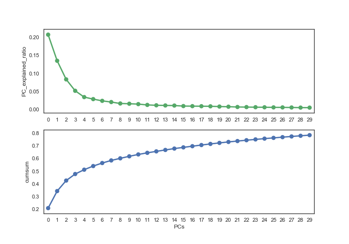
Using some visualization chart to help determining chosen PC numbers. Here I use variance explanation ratio, and threshold to 80%, which means almost 80% of information are preserved, the result is 30 PCs.
#  PCA
from sklearn.decomposition import PCA
from sklearn.pipeline import Pipeline
from sklearn.preprocessing import StandardScaler,MinMaxScaler
import matplotlib.pyplot as plt
import seaborn as sns
sns.set_style("white")

# make pipe
pipe = Pipeline([('scaler',StandardScaler()),
                 ('pca',PCA(n_components=30))])


# fit th model
pc = pipe.fit_transform(df)

# check how many PCs should we have
elbow_df = pd.DataFrame(pipe.steps[1][1].explained_variance_ratio_,
                        columns=['PC_explained_ratio'])

fig,(ax1,ax2) = plt.subplots(2,figsize=(10,7))

sns.pointplot(x=elbow_df.index,markers='o',y='PC_explained_ratio',color='g',data=elbow_df,ax=ax1)
sns.pointplot(x=elbow_df.index,markers='o',y=elbow_df['PC_explained_ratio'].cumsum(),ax=ax2)
ax2.set_ylabel('cumsum')
ax2.set_xlabel('PCs')
plt.show()
fig.savefig('pca.png')
3. Visualization
A simlpe way to interpret t-SNE plot is to find clusters, but notice that the distance between each cluster has no meaning, smaller distance doesn’t neccessary equal to higher similarilty. Ref
Hyperparameter of t-SNE
-
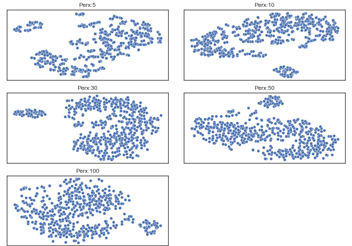
There is a parameter called perplexity, in a sense, a guess about the number of close neighbors each point has. And has been repeatly be noted as an important setting to t-SNE.
-
At this notebook, I chose 50, since the structure from perplexity 5~50 are similar to each other, so it has higher chance to catch real cluster patterns.
prex = [5,10,30,50,100]
fig = plt.figure(figsize=(10,7))
plt.subplots_adjust(left=.02, right=.98, bottom=.001, top=.96, wspace=.1,
                    hspace=.18)
for i,rate in enumerate(prex):
    model=TSNE(perplexity=rate,n_iter=5000)
    ax = fig.add_subplot(3, 2,i+1)
    transformed=model.fit_transform(X)
    sns.scatterplot(x=transformed[:,0],y=transformed[:,1],ax=ax)
    plt.xticks(())
    plt.yticks(())
    ax.set_title("Perx:{}".format(rate))
fig.savefig("tsne.png")
4.Models
The main variable is contamination rate, which is the portion of outliers in this sample, and I’ve tried several rate as I don’t have ground truth here.’
from sklearn.ensemble import IsolationForest
from sklearn.covariance import EllipticEnvelope
from sklearn.neighbors import LocalOutlierFactor
from sklearn import svm
from sklearn.manifold import TSNE

contamination = [0.05,0.1,0.2,0.3]

fig = plt.figure(figsize=(12,9))
plt.subplots_adjust(left=.02, right=.98, bottom=.001, top=.96, wspace=.1,
                    hspace=.01)

# create 2d t-SNE plot
model=TSNE(perplexity=50,n_iter=5000)
transformed = model.fit_transform(X)
df_plot = pd.DataFrame(transformed, columns=['xs','ys'])

palette ={1: "C0", -1: "C1"}

plot_num = 1

for i,rate in enumerate(contamination):
    # fit_transform models
    algorithms = [("Isolation Forest",IsolationForest(contamination=rate,random_state=42)),
                  ("Robust Variance", EllipticEnvelope(contamination=rate)),
                  ("Local Outlier Factor",LocalOutlierFactor(n_neighbors=40,contamination=rate)),
                  ("One-Vlass SVM",svm.OneClassSVM(nu=rate, kernel="rbf",gamma=0.01))]

    for name, algor in algorithms:
        if name == "Local Outlier Factor":
            label = algor.fit_predict(X)
        else:
            label = algor.fit(X).predict(X)

        df_plot['label'] = label
        ax = fig.add_subplot(len(contamination),len(algorithms),plot_num)
        sns.scatterplot(x='xs',y='ys',data=df_plot,hue='label',palette=palette,ax=ax)
        if i==0:
            ax.set_title("{}".format(name))
        plt.xticks(())
        plt.yticks(())
        plot_num +=1


fig.savefig('allmodels.png')
Conclusion
-
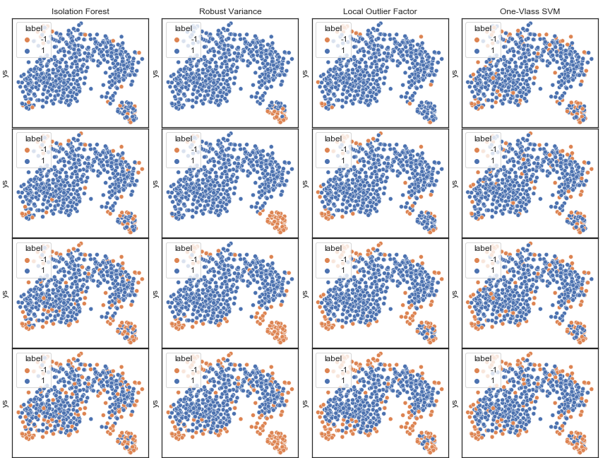
As t-SNE chart shows that there seems to have two clusters, but it doesn’t mean that the smaller one is outliers, also dense cluster doesn’t mean that it will have lower variance.
-
Variance : It has been observed that isolation forest local outlier factor and one-class svm tend to detect outliers starting by identifying points around the edge of clusters, so I think it is better to use these methods when detecting system errors that are generally generated because of variance, e.g. measurement error.
-
Bias : On the other hand, robust variance are showing that they intend to identify points that are far from major cluster to be outliers, so I think they are better to use for detecting outliers that generated becuse of bias, means there has some shift form original pattern.
-
So, the problem would be which model to be chosen and with how many contamination rate, and My conclusion is depends on the purpose. If the case should only contain one cluster then robust variance would be the choice, however, removing noise is what really important, e.g. want to get pure clean data then isolation forest and local outlier factor would doing great job .


